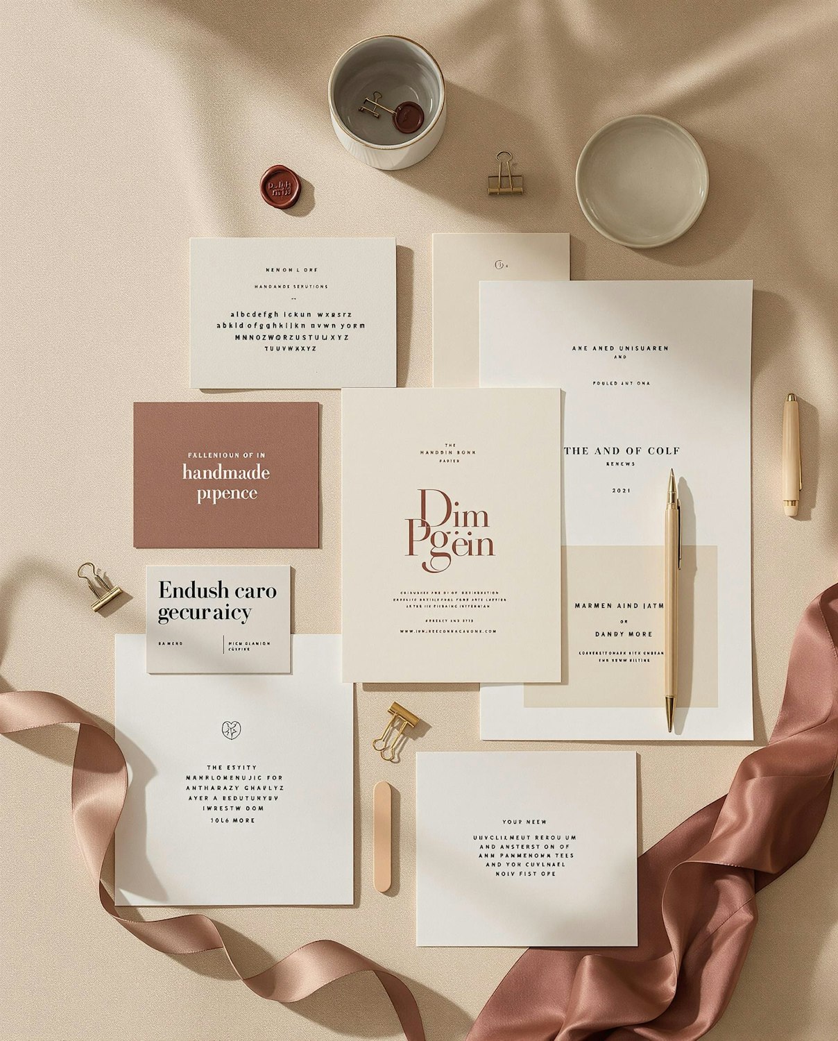
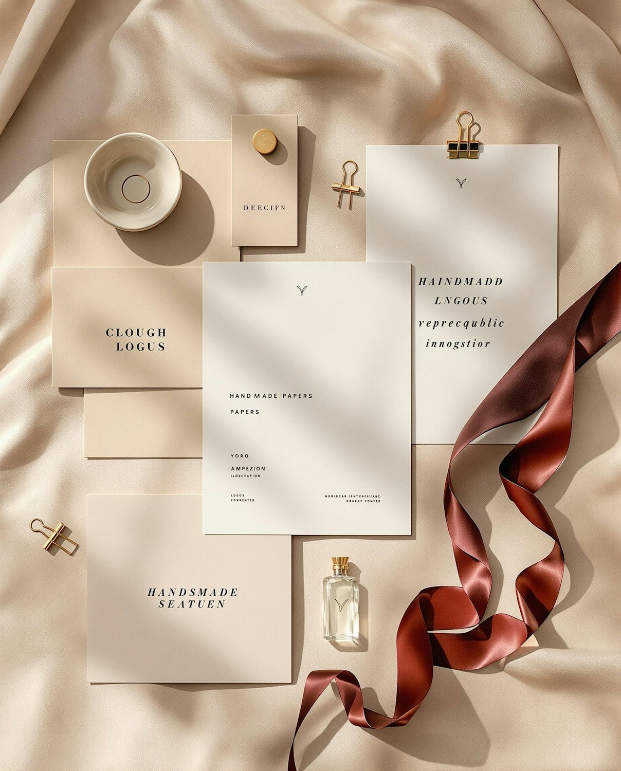
Studio Fennick gives a Glasgow bakery a warm, wood-fired identity
A hand-cut wordmark, flour-sack packaging and a shopfront that glows like an open oven door.
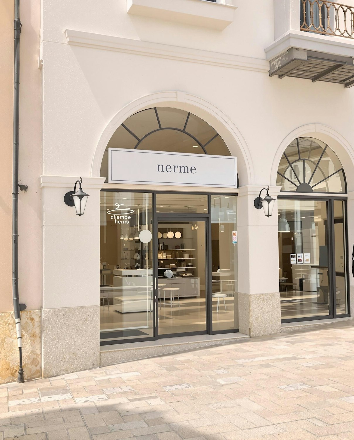
Grain & Ember started as a single wood-fired oven in a railway arch in Glasgow’s Southside. When the bakery took over a corner shop with tall arched windows, its founders asked Studio Fennick to build an identity that felt as warm as the bread and as plain-spoken as the people baking it.
The studio’s answer is a wordmark cut by hand from linocut prints of the bakery’s own peel boards. Each letter keeps a slightly scorched edge, a nod to the oven, and the ampersand is drawn as a single curl of rising dough.
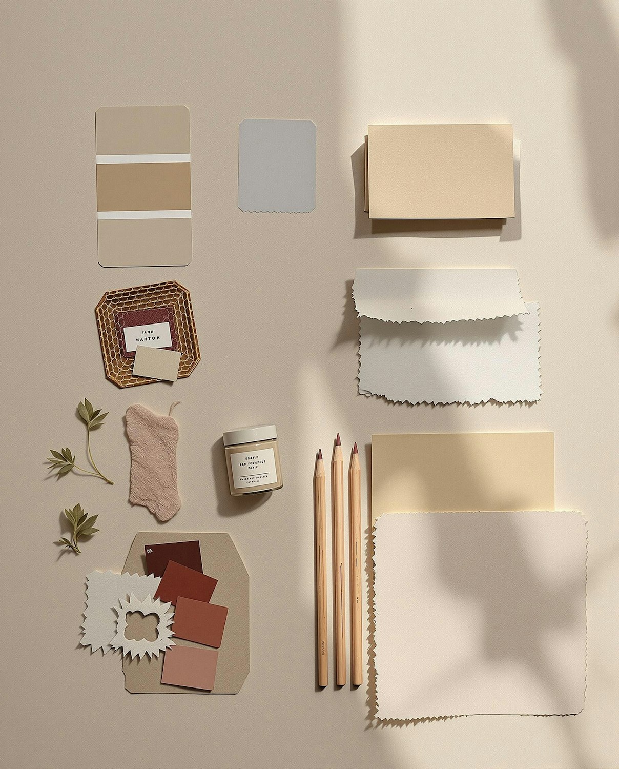
A palette from the proving room
Colours are taken from what is already on the counter: rye, crust, flour and a deep ember red reserved for the shopfront and the daily specials board. Packaging is printed in one colour on unbleached paper so the bags can be reused, and the sticker that seals each loaf doubles as a baking timestamp.
We wanted people to recognise the bag from across the street, but never feel like they were buying a brand.
“It should feel like the bakery wrote it themselves,” says Fennick’s creative director Isla Moran.