Northbound Works names 120 colours for a Norwegian paint maker
For Tind, the Oslo studio built a colour-first identity where every swatch has a name, a story and a place on the map.
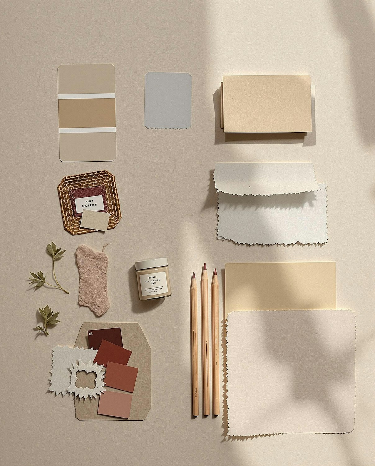
Tind has been mixing paint in the same valley outside Lillehammer since 1952, but its colour cards had grown into a confusing grid of codes. Northbound Works was asked to make the range easier to choose from and harder to forget.
The studio started by naming every one of the 120 colours after a real place in Norway, from fjords and mountain huts to a single famous bus stop. Each swatch card carries the name, the coordinates and a one-line story, and the cards fold into a pocket atlas customers can take home.
Letting the paint lead
The rest of the identity steps back. A quiet sans serif, generous white space and a logotype based on the shape of a paint chip keep attention on the colour itself. “Our job was to get out of the way of 120 beautiful colours,” says Northbound’s Sigrid Haug.