Atelier Vireo wraps a Montréal perfumer in satin and burgundy
For Maison Ardent, the studio built an identity around ribbon, scent notes and a logotype that leans like handwriting.
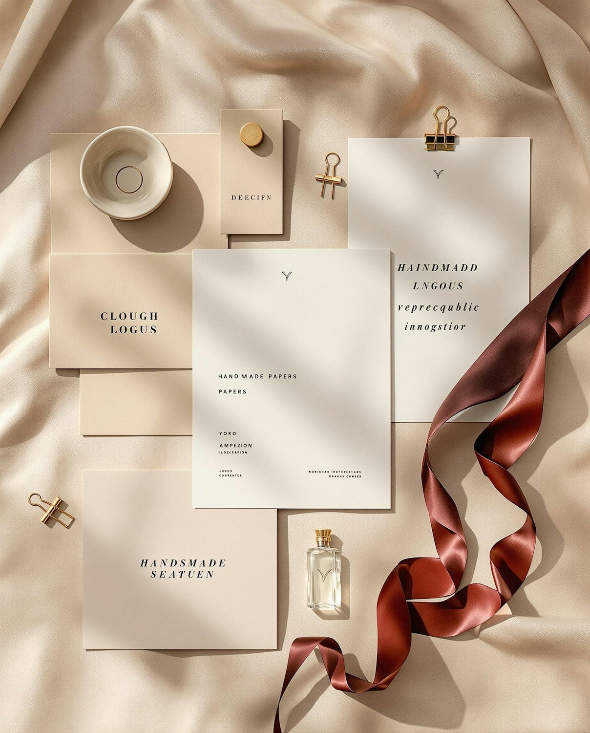
Maison Ardent makes small-batch perfume in a studio above a florist in Mile End. The founders asked Atelier Vireo for an identity that felt intimate without tipping into the clichés of luxury fragrance.
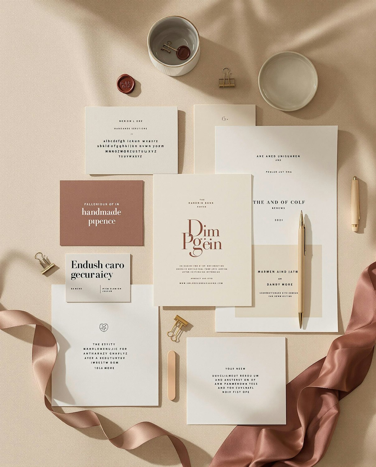
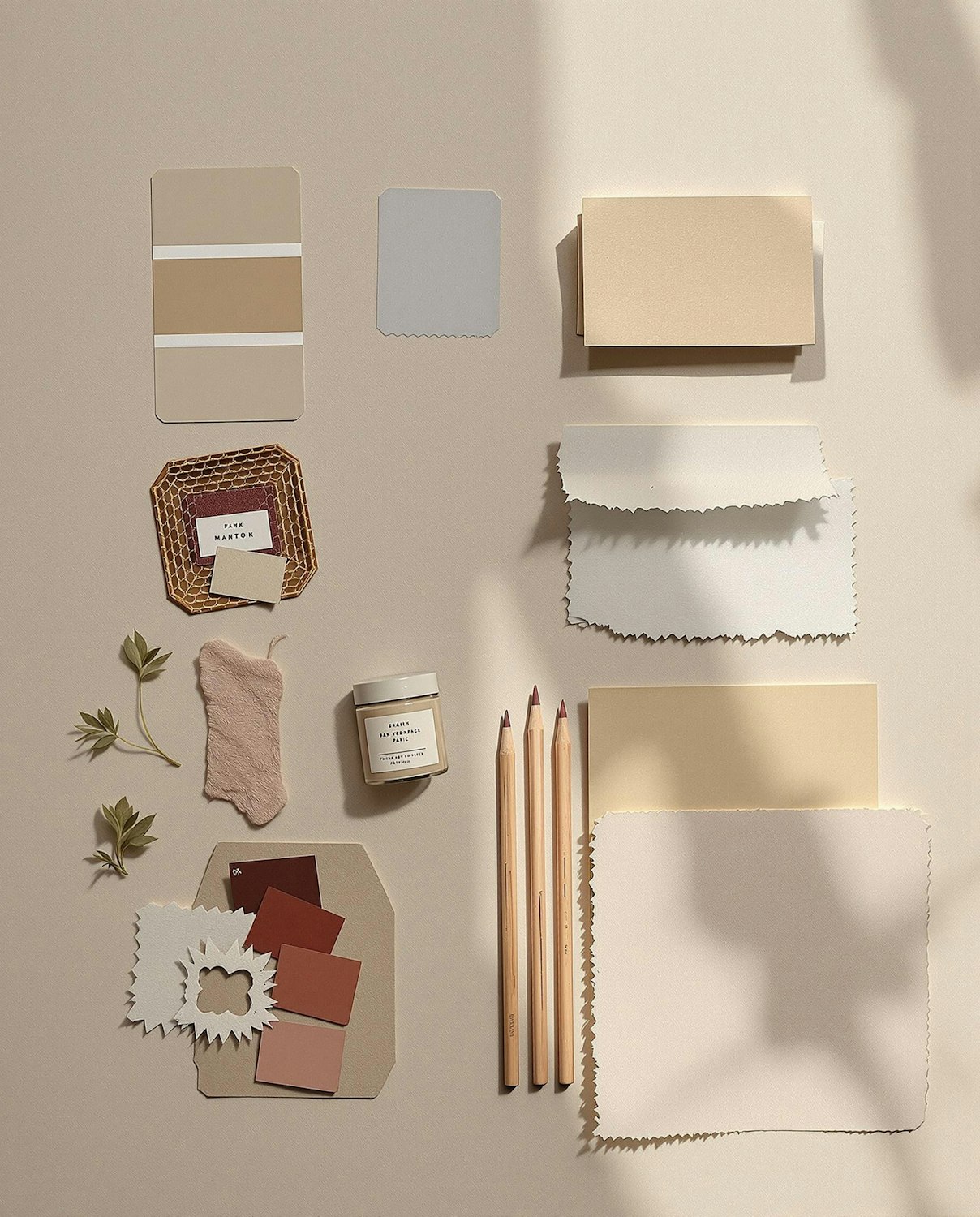
Vireo began with the ribbon. Each bottle is tied by hand with a length of burgundy grosgrain, and the colour became the anchor for everything else, from tissue paper to the website’s link colour. The logotype is a high-contrast italic with a gentle forward lean, drawn to echo the founder’s handwriting on early sample labels.
Labels that read like notes
Rather than poetic names, every perfume is labelled with its three main ingredients, set in a small typewriter face. “People want to know what they are smelling,” says Vireo’s Camille Roy. “The romance comes from the bottle and the ribbon, not from adjectives.”