Loom & Ledger strips Saltmarsh skincare back to the essentials
Uncoated white cartons, one typeface and a tide-chart pattern for a Melbourne brand that makes four products very well.
Saltmarsh makes four products: a cleanser, a serum, a balm and a sunscreen, all formulated with kelp harvested off the Victorian coast. Loom & Ledger’s brief was to make the range feel clinical enough to trust and calm enough to keep on a bathroom shelf.
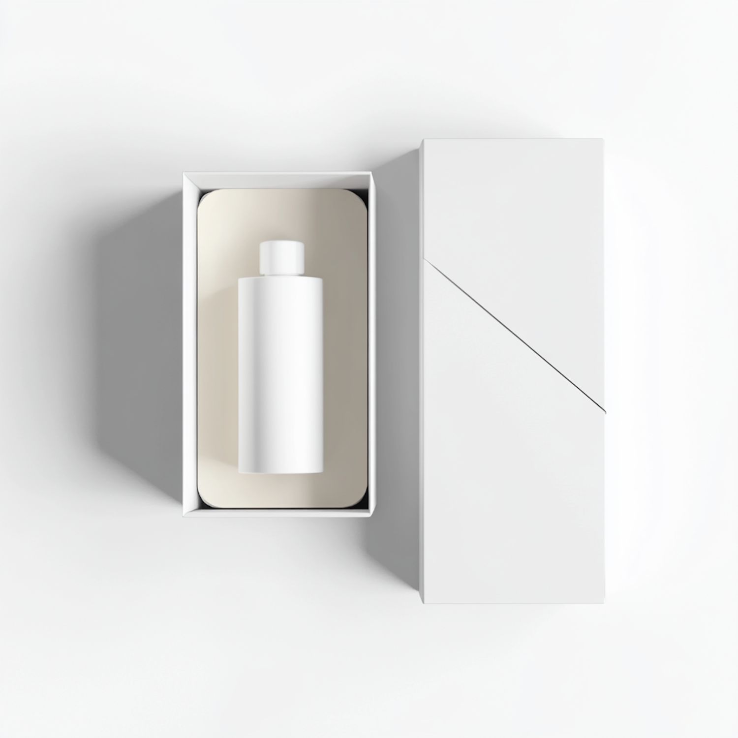
The packaging is uncoated white board with a single debossed band, inside which the product name and key ingredient sit in one weight of a neutral grotesk. A fine-line pattern, drawn from local tide charts, is printed inside each carton, so the brand reveals itself only when the box is opened.
A system that knows when to stop
“Skincare packaging tends to over-explain,” says studio co-founder Hana Ruiz. “We gave every carton exactly three pieces of information and moved everything else online.” The result is a shelf that reads instantly and a range that can grow without needing a new rulebook.