Parallel State turns a Brooklyn bookshop’s receipts into a brand
For Dogear Books, the New York studio built an identity from folded corners, printed receipts and a shopfront that changes weekly.
Dogear Books is an independent shop in Carroll Gardens with arched windows, creaking floors and a loyal crowd of regulars. When it opened a second room for events, the owners asked Parallel State to give the business a clearer identity without losing its scruffy charm.
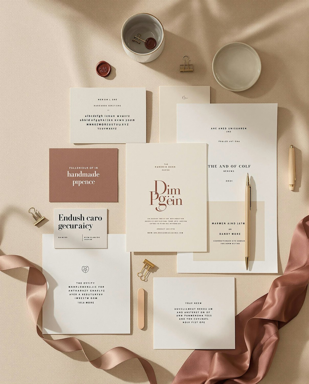
The studio noticed that customers loved the shop’s long printed receipts, which list every book bought with a short handwritten recommendation. Parallel State redesigned the receipt as the heart of the brand: a narrow, monospaced layout with a folded corner that became the logo.
A window that rewrites itself
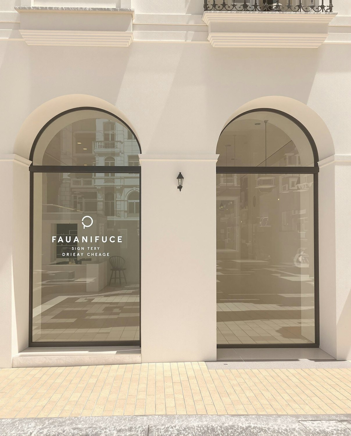
The arched windows now carry a weekly hand-painted list of staff picks, set in the same receipt-style typography. “The shopfront is basically a receipt for the neighbourhood,” says Parallel State’s Noor Haddad.