Kaya & Lund stitches together an identity for Ravel textiles
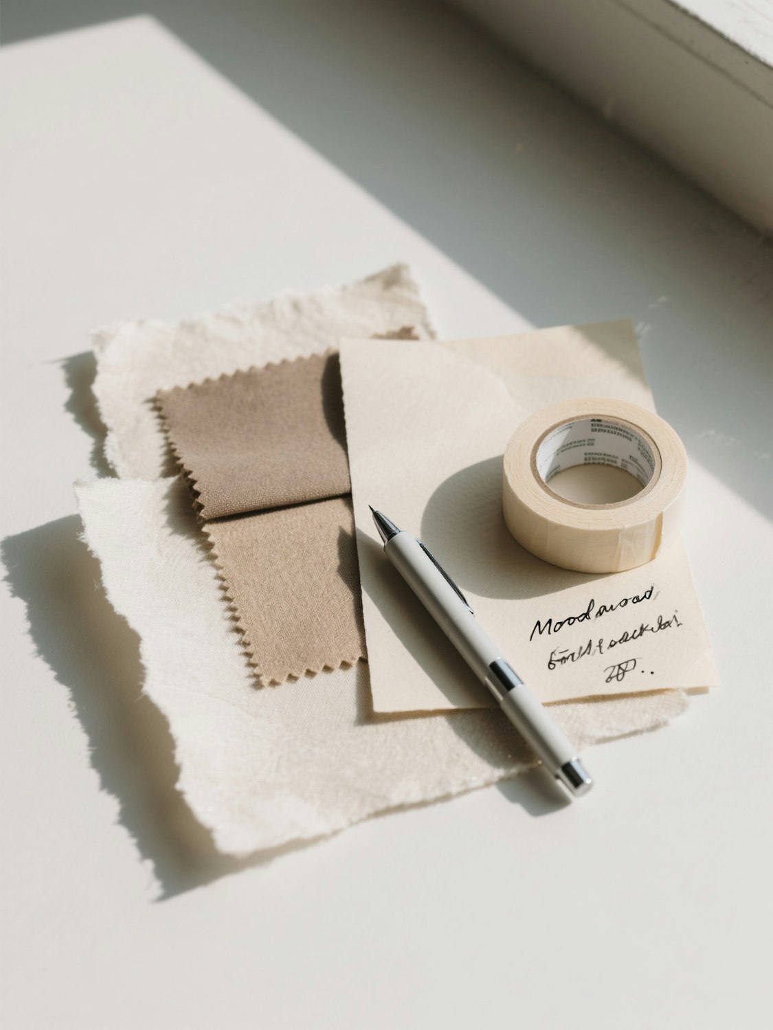
Masking tape, handwritten labels and a woven logotype give a Copenhagen fabric studio a brand that feels made by hand.
Ravel weaves upholstery and curtain fabric for architects and interior designers. Its founders work from a small mill in Nordhavn and wanted an identity that reflected the hand-finished, slightly imperfect nature of the cloth.
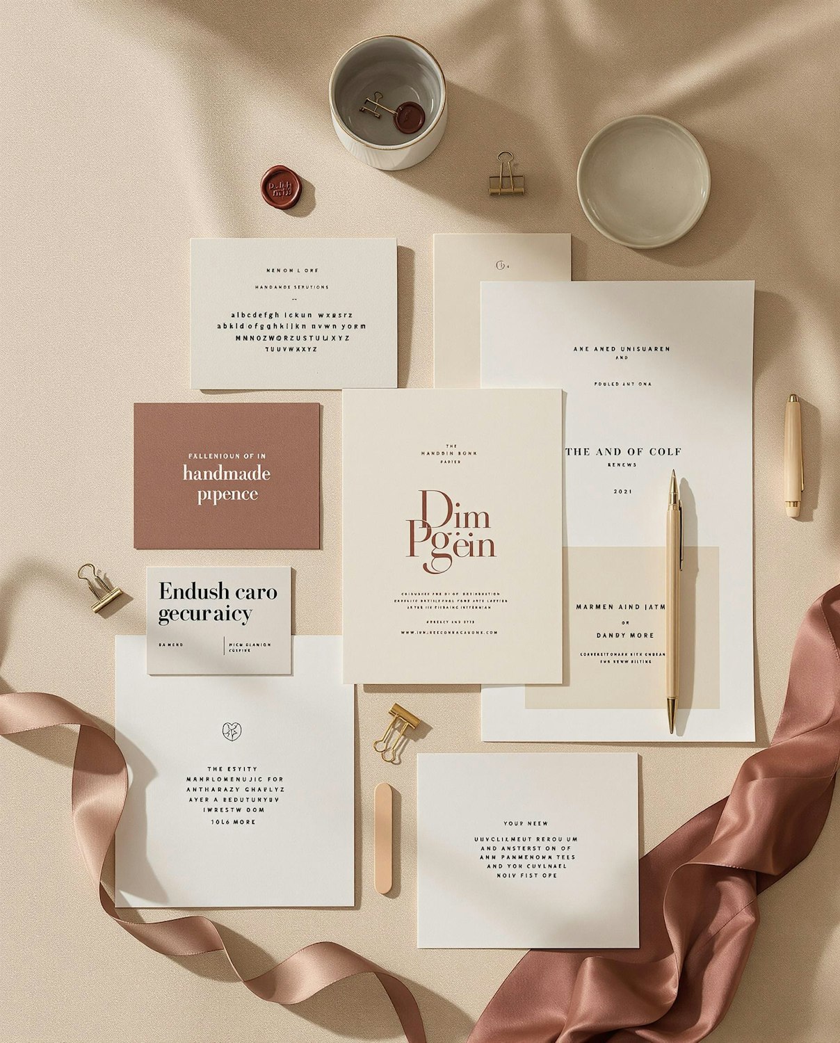
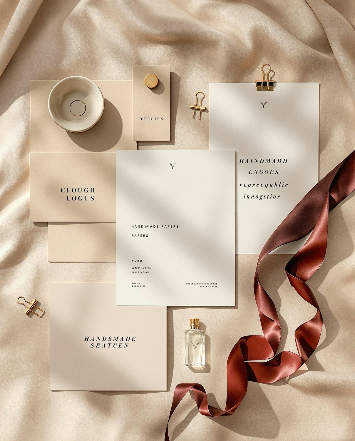
Kaya & Lund built the logotype on a weaving grid, so each letter is made of horizontal and vertical threads that can be embroidered, printed or woven directly into a selvedge. Swatch books are bound with masking tape and labelled by hand, a habit the studio noticed in the mill and decided to keep.
A colour system borrowed from the loom
Instead of a fixed brand palette, the identity takes its colours from whatever is on the loom that season. Templates pull a warp colour and a weft colour from the latest collection, so the brand shifts gently with the fabric.