Is quiet packaging the new loud?
Blank boxes, tiny type and almost no colour are everywhere on the shelf. We asked what happens when every brand whispers.
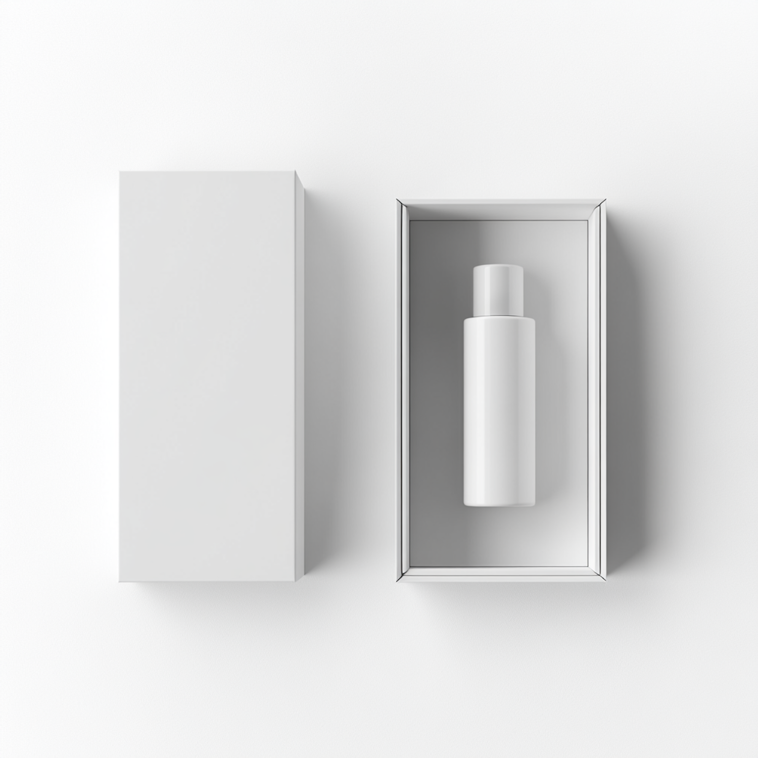
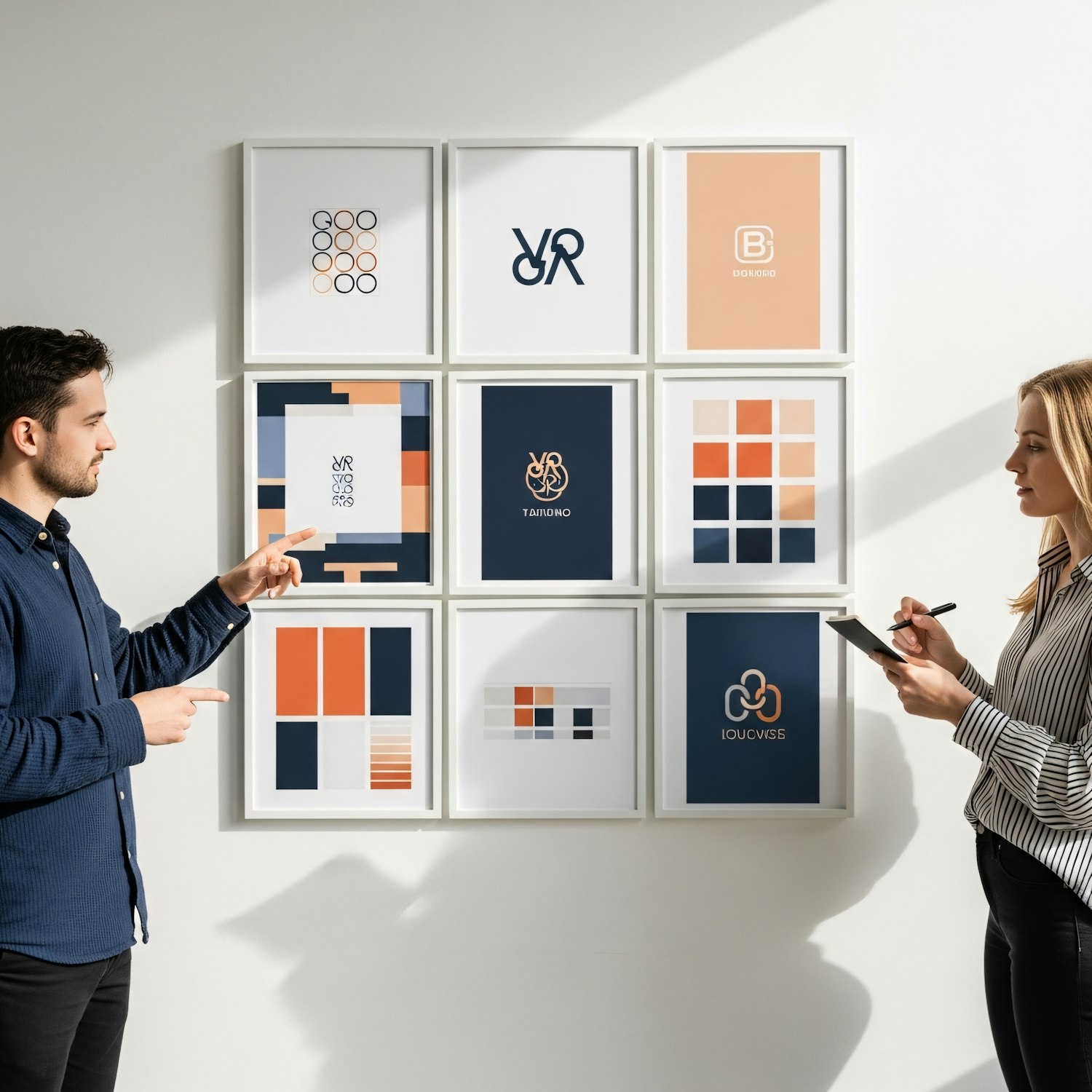
Walk down any beauty or wellness aisle and you will find a sea of white cartons, small grotesk type and a single line of copy. Quiet packaging has become a shorthand for honesty, quality and a certain kind of good taste.
It is easy to see why. Minimal packaging photographs well, travels well across markets and signals that the product inside does not need to shout. For young brands, it is also cheaper to print and simpler to keep consistent.
When everyone whispers
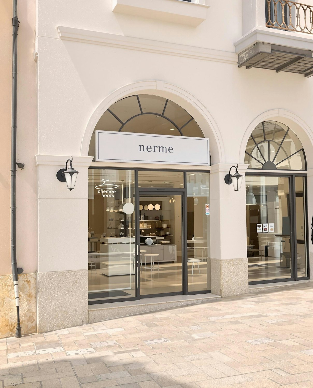
The problem is that restraint stops being distinctive once everyone adopts it. If ten brands on the same shelf all use white board and lowercase sans serif, the quiet one becomes the one with a colour.
Quiet, but specific
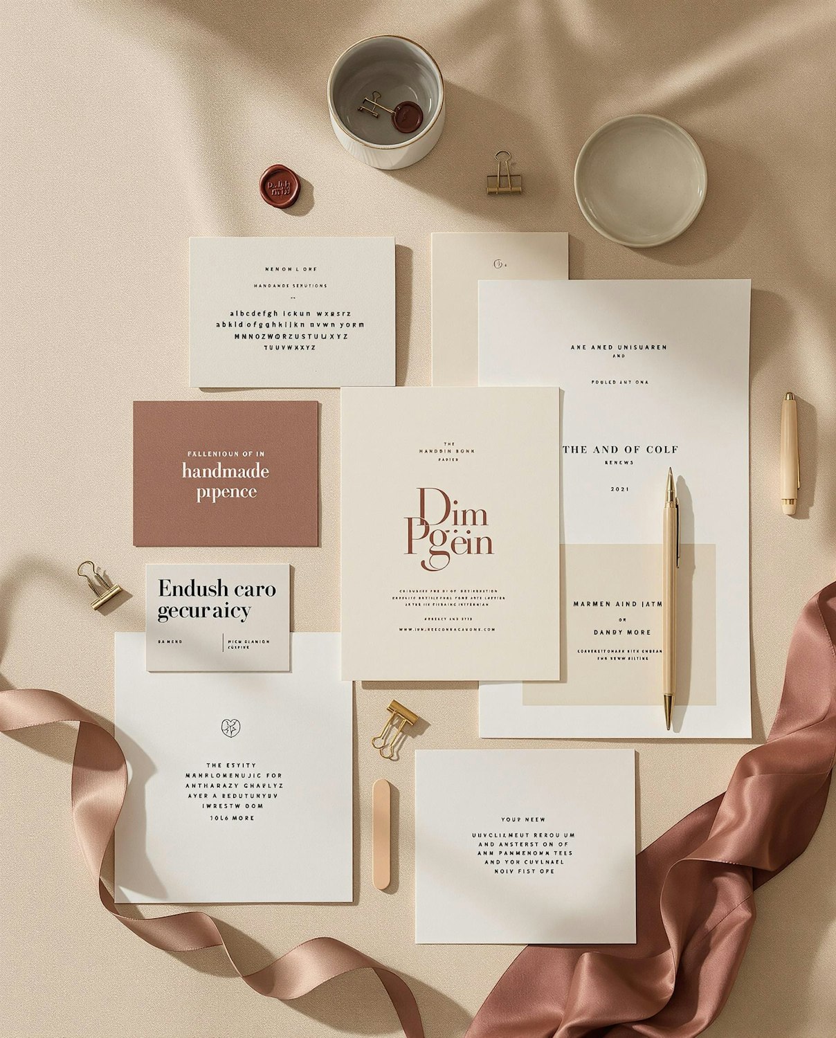
The best minimal packaging we see is not empty, it is specific. A carefully chosen paper, an unexpected texture, a fold that only one brand uses. Quiet works when it is a decision rather than a default.