Alder Serif brings the grain of timber to text type
Zürich’s Alder Foundry spent four years on a book face with soft contrast, sturdy serifs and a little bit of bark.
Alder Serif began as a commission for a forestry museum and grew into a full text family over four years. Its designers, Mara Keller and Tobias Frei, wanted a book face that felt warm in long passages without losing the precision readers expect from Swiss typography.
The contrast is low and the serifs are short and slightly cupped, like the end grain of a cut branch. At text sizes the typeface reads calmly. Set large, small irregularities in the curves give it a woodcut texture.
Built for books and posters
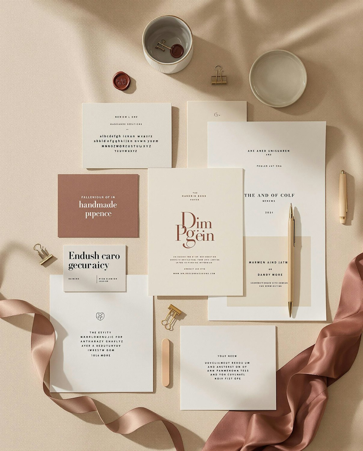
The family includes eight weights with matching italics, small caps, old-style figures and a set of display cuts with tighter spacing. Alder Foundry launched it with a series of large specimen posters printed in a single brown ink and hung in a sawmill outside the city.